


How to Find a Black and Grey Tattoo Artist: A Portfolio Checklist
- Dec 10, 2025
- 11 min read
📌 Key Takeaways
A strong black and grey tattoo portfolio shows smooth gradients, solid blacks, clean edges, readable contrast, and—most critically—healed proof that these qualities survive months of healing.
Demand Healed Examples: Fresh tattoos mislead; healed work reveals whether contrast, gradients, and edges maintain integrity after months, not days.
Check Gradient Smoothness: Seamless grey wash transitions without visible banding or peppery texture indicate controlled shading technique that preserves dimensional depth.
Verify Solid Black Saturation: Dense, evenly saturated blacks with sharp edges anchor contrast and prevent patchy healing that requires touch-ups.
Assess Edge Clarity: Steady structural lines without wobble or blowout demonstrate hand control that keeps features readable over time.
Test Contrast From Distance: Compositions that remain clear when viewed across the room prove strong value separation that survives real-world viewing conditions.
Healed proof separates documented mastery from optimized photography.
Clients evaluating black and grey specialists in Miami will gain systematic assessment criteria here, preparing them for the consultation questions and studio visit checklist that follows.
You're looking at portfolios online, trying to spot the difference between competent work and true mastery. One artist's Instagram feed shows dramatic contrasts and soft shadows. Another displays similar styles but something feels off—you just can't name it yet.
Black and grey tattoos are judged by standards most people haven't learned to see. Unlike color work, where vibrant pigments can mask technical flaws, this style depends entirely on contrast control, gradient smoothness, and how the ink settles after months of healing.
A portfolio is a promise. Make sure it's one they can keep.
This checklist teaches you how to evaluate portfolios using the same criteria specialists use when judging competition work. You'll learn to spot smooth grey washes, verify healed results, and identify red flags before you book a consultation.
Start Here: What a Black and Grey Specialist's Portfolio Should Show
Black and grey realism functions like charcoal drawing on skin. The artist builds dimension through layered washes—controlled passes of diluted black ink that create the illusion of light and shadow. Without color to add visual interest, every gradient must be intentional. Every edge must be precisely defined. The contrast between the darkest blacks and the lightest skin tones determines whether the tattoo reads clearly from across a room or collapses into flat grey haze.
This style requires different skills than color work. An artist might excel at vibrant traditional tattoos but struggle with the subtlety black and grey demands. That's why portfolio evaluation matters.
A strong portfolio demonstrates repeatable control over three things: smooth shading without choppy steps, structural integrity maintained through value-defined edges and anatomical flow, and readable contrast that maintains depth after healing.
Most portfolios show highlight reels. Artists naturally feature their strongest pieces under optimal lighting conditions. Your job is to look past the presentation and assess the technique. You need proof that the work heals well, maintains contrast over time, and demonstrates consistency across multiple clients and placements.
Expect to review at least 10-15 examples before making a judgment. One standout portrait doesn't prove mastery. Look for pattern recognition: smooth gradients in every piece, consistent edge clarity across different designs, solid blacks that don't appear patchy or uneven.
The 5-Point Black and Grey Portfolio Checklist
Save this section as your portfolio audit card—use it while comparing artists to evaluate each one systematically:
Smooth gradients (grey wash technique)
Solid blacks with clean edges
Structural definition and edge control
Strong contrast and readable composition
Healed examples (months old, not days)
Each point reveals a specific technical skill. Together, they predict how your tattoo will look after healing—not just how it photographs fresh.
1) Smooth Gradients: How to Spot Real Grey Wash Control

Grey wash creates depth through gradual transitions from light to dark. In a well-executed portrait, you should see soft shadows defining cheekbones, natural highlights catching the bridge of a nose, and believable light sources casting consistent directional shadows. Background elements like clouds, smoke, or fabric should fade smoothly without visible breaks in tone.
Look for: Seamless transitions where you can't identify where one shade ends and another begins. The gradient should feel continuous, like watercolor bleeding naturally across paper. Check areas with complex lighting—the side of a face turning away from light, folds in clothing, or atmospheric perspective in landscape elements. Good shading looks continuous, moves from dark to light without harsh steps, and preserves form so cheeks still look rounded and fabric still looks folded.
Avoid: Banding appears as visible "steps" between tones rather than smooth transitions. Peppery texture looks like salt scattered across shaded areas instead of even grey wash. Muddy midtones occur when an artist overworks an area, losing definition between highlights and shadows. These issues typically stem from an imbalance between machine voltage and hand speed (causing unintentional stippling), or trauma from reworking the skin too aggressively, which muddies the ink.
Consider this example: in a portrait, the cheek transition should fade smoothly into the jaw shadow. If the cheek looks "striped" or speckled, the technique may be inconsistent—or the photo may be hiding texture with editing.
Quick test: Zoom in on gradient areas to check for abrupt tone jumps. Then zoom out and view from arm's length. The gradient should maintain its smoothness at both distances. If it only looks good when zoomed in, the technique won't hold up when viewed naturally on skin.
2) Solid Blacks: Saturation That Heals Evenly

Solid black areas anchor the composition and define the tattoo's maximum contrast. In portraits, this might be hair, deep shadows, or background elements. These blacks should appear uniformly saturated—no light spots, streaks, or patchiness.
Look for: Dense, even coverage with sharp edges where black meets lighter shading. The black should look intentional and deliberate, not rushed or inconsistent. Dark areas that support the image through deep shadows and background separation, not random dark patches. Check multiple examples across different body placements to confirm the artist maintains saturation regardless of skin texture or location.
Avoid: Patchy blacks with visible gaps in coverage often indicate insufficient passes or poor ink saturation during application. These areas tend to heal unevenly and may require additional touch-up sessions. Blurry borders where solid black meets grey wash suggest the artist struggled with clean transitions.
Inconsistent blacks across a portfolio reveal technique issues. One perfect piece surrounded by several with patchy coverage indicates the artist got lucky rather than demonstrating reliable skill.
Quick test: Compare multiple tattoos in the portfolio—do the darkest areas look consistently solid across different pieces? Inconsistency often predicts extra touch-ups later.
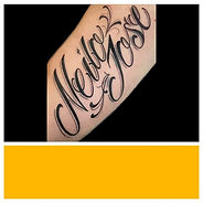
3) Structural Definition: The Edge of Realism
Lines define structure. In black and grey realism, they establish boundaries between elements and create visual clarity. Whether defining the subtle silhouette of a feature or providing structural contrast, these boundaries must be stable without unintended blurring.
Look for: Smooth, steady lines without wobble or hesitation marks. The line weight should match the design's intent—finer lines for delicate details, bolder lines for structural elements. Clean edges and details like eyes, hair strands, and small textural lines that stay sharp without looking overworked. Zoom in on curved lines like jaw contours or petal edges to verify they flow naturally without sudden thickness changes.
Avoid: Wobbly lines indicate unsteady hand control. Fuzzy edges suggest the needle was run too shallow or the artist worked too slowly. Blowouts occur when ink spreads beyond the intended line, creating a shadowy halo effect. This happens when needles penetrate too deeply or when artists work too aggressively on thin skin areas.
Even specialists occasionally have minor line imperfections, but they should be rare exceptions rather than recurring patterns across the portfolio.
Quick test: Look at close-ups of fine details. If the portfolio avoids close-ups entirely, that is information.
4) Contrast and Composition: Does It Read From Six Feet Away?
A technically perfect tattoo that lacks strong composition won't hold visual impact. The piece needs clear focal points and intentional separation between major elements. In a portrait, this means distinct separation between hair and face, or foreground and background. In a nature scene, it requires atmospheric depth that makes distant elements recede naturally.
Look for: Clear light sources casting believable shadows. Strong separation between the darkest darks and lightest lights. A clear focal point that draws the eye immediately. Background elements that support rather than compete with the main subject. Separation between subject and background where hair distinguishes itself from skin, and foreground separates from background.
Avoid: Flat compositions where everything sits at the same tonal value. This happens when artists work too conservatively with their blacks or fail to establish strong highlights. The result looks muddy and loses readability from any distance. Overly light work with weak separation where the entire tattoo sits in one grey range.
Quick test: View portfolio images from across the room—or squint at the photo on screen. The tattoo should remain clear and readable. If details disappear or the image loses definition, the contrast structure needs improvement.
5) Healed Work: The Non-Negotiable Proof
Fresh tattoos photograph beautifully. The skin is red and inflamed, which actually enhances contrast temporarily. Professional lighting and editing can make even mediocre work appear exceptional. Healed work tells the truth. Healed proof is treated as non-negotiable when evaluating black and grey specialists.
Look for: Examples that are explicitly labeled as healed and show dates or timelines—months old, not "day after" shots. Look for retained contrast where blacks should still appear solid and gradients should maintain their smooth transitions. The tattoo should look settled and natural on the skin, not raised or distorted. Edges should still look deliberate, not blurred into surrounding skin. Midtones should still have separation so realism keeps depth rather than flattening into one grey layer.
Avoid: Portfolios showing only fresh work immediately after completion. Heavy filtering, HDR effects, or extreme editing that makes it impossible to judge actual ink quality. Single "after healing" shots without multiple examples proving consistency.
Ask directly: "Can I see healed examples of work similar to what I'm requesting?" A specialist will have numerous healed photos from follow-up appointments and client check-ins. Reluctance to show healed work is a significant warning sign.
The most reliable portfolios show the same tattoo fresh and healed side-by-side. This demonstrates the artist's work maintains integrity through the healing process. Look for consistency across multiple clients—one great healed piece could be chance; five or ten prove pattern.
For a dedicated explanation of how fresh ink can differ from healed results, review the healed vs. fresh guide.
Bonus Checks That Separate Specialists From Generalists
Beyond the core checklist, these additional factors indicate genuine specialization:
Range across skin tones and placements. Black and grey behaves differently on various skin tones. Darker skin requires adjusted contrast strategies to maintain readability. An artist working exclusively on light skin may not understand these adaptations. Look for portfolio diversity that demonstrates versatility without sacrificing quality.
Subject matter alignment. If you want a memorial portrait, verify the artist has successfully completed portraits. If you need a cover-up with heavy black and grey work, confirm they've handled similar challenges. General realism skills don't automatically translate to every subcategory.
Multi-session cohesion. Large pieces like sleeves or back pieces require multiple sessions to complete. Review examples showing progression across sessions. The artist should maintain consistent style, contrast, and technique throughout the project. Visible breaks or changes in approach between sessions indicate inconsistent skill application.
Studio-Level Checklist: Safety and Professionalism Signals
Technical skill matters, but so does the environment where the work happens. When visiting studios in person—which you can easily do in the Miami area, including Hialeah—verify these professional standards:
Clean, organized workstations utilizing single-use, disposable grips and needles, with all high-touch surfaces (lamps, power supplies) barrier-wrapped. Artists should open new needles, ink caps, and barriers in front of you. If the studio uses steel grips or reusable tubes, an operational autoclave (sterilizer) must be present and biologically tested. However, many modern studios now utilize 100% disposable, single-use systems; in these cases, verify that all equipment comes from sealed, sterile blister packs rather than looking for an autoclave. The studio should smell clinically clean. While the faint scent of medical-grade disinfectants (like Cavicide or bleach) is a sign of active sanitation, avoid studios with overpowering chemical fumes that may be masking odors, or any hint of musty mildew.
Professional communication extends beyond friendliness. Artists should ask detailed questions about your concept, explain their process clearly, discuss realistic timelines, and provide written aftercare instructions. They should be willing to show you healed examples and discuss potential challenges specific to your placement or skin type.
For readers who want authoritative background on infection-prevention and occupational exposure controls, the following sources provide general guidance: OSHA's Bloodborne Pathogens Standard, and FDA consumer guidance on tattoo safety
Questions to Ask Before You Book
Use this copy/paste consultation script:
"Can I see healed examples similar to my idea and placement?" This verifies the artist has experience with your specific request and can show long-term results rather than just fresh photos.
"How do you adjust contrast for my skin tone and how this area heals?" Different body locations heal differently. Inner arms, ribs, and hands require different approaches than shoulders or calves. The artist should explain their strategy specific to your situation.
"What's your aftercare plan for black and grey shading?" Proper healing dramatically affects final results. The artist should provide detailed instructions and be available for questions during the healing period. For general aftercare education, review Fame Tattoos' tattoo aftercare guide.
"How many sessions do you expect for this size and detail?" This reveals whether the artist is being realistic about the scope of work. Underestimating sessions often means rushing through detail to meet an arbitrary timeline. Overestimating might indicate inefficiency.
Their answers should be specific and confident. Vague responses or dismissive attitudes toward these questions suggest the artist isn't truly invested in your long-term satisfaction.
Red Flags That Show Up in Portfolios
Certain patterns indicate problems:
Only fresh photos with heavy filtering. If every image looks like it was shot in a professional studio with dramatic lighting and heavy editing, you can't judge the actual tattoo quality. Authentic portfolios include natural lighting, close-up detail shots, and honest documentation.
Choppy gradients and muddy midtones across multiple pieces. One piece with technical issues might be a learning experience. Consistent problems reveal systemic skill gaps the artist hasn't resolved.
No close-ups or detail shots. Artists confident in their technique show detail views that reveal line quality, gradient smoothness, and saturation consistency. Portfolios showing only full-composition photos from a distance often hide technical weaknesses. No variety across different pieces or skin tones also raises concerns.
Inconsistent style or quality jumps. If half the portfolio shows exceptional work and half shows mediocre results, question whether the artist actually completed all pieces. Some artists showcase guest artist work or take credit for collaborative projects.
Defensive responses to questions about healed work. Professional artists understand the importance of healed proof and eagerly share it. Defensiveness, excuses, or changing the subject indicates they lack strong healed examples.
What to Do Next in Miami
You now have the vocabulary and framework to evaluate portfolios with confidence. Here's your action plan:
Shortlist two to three specialists. Don't commit to the first artist you find. Compare their healed work using this checklist. Look for consistency across multiple examples, not just one impressive piece.
Visit studios in person when possible. The Miami area offers the advantage of accessible studios where you can assess cleanliness and professionalism directly. Online research provides initial filtering, but in-person visits confirm your final choice. You'll see the work environment, meet the artist, and get a feel for whether their communication style matches your needs.
Bring this checklist to consultations. Don't be shy about asking to see specific examples that address each checkpoint. A true specialist will appreciate your thoroughness and use it as an opportunity to demonstrate their expertise.
Review their approach to black and grey tattoos in their body of work. Examine not just individual pieces but their overall portfolio philosophy. Do they emphasize healed results? Do they show progression and learning? Do they demonstrate range while maintaining quality? Explore black and grey work from Fame Tattoos to see examples of this approach.
Understand the difference between fresh and healed work. This knowledge positions you to ask informed questions and recognize when artists are showing you only their most flattering angles rather than honest documentation of their capabilities.
Remember that investing time in portfolio evaluation significantly reduces your risk of permanent regret. Black and grey realism requires specific technical skills that not every tattoo artist possesses. By using these evaluation criteria, you're filtering for true specialists who can deliver the lasting quality your meaningful tattoo deserves.
Learn more about the studio and approach, or reach out with questions to set up a consultation conversation.
Our Editorial Process: Our team creates educational tattoo content based on real studio experience, client questions, and published resources from our own site. We aim to explain what to look for, what to ask, and what to expect so you can make confident decisions about permanent body art.
Disclaimer: This article is educational and does not provide medical advice. For health concerns about healing or infection risk, consult a licensed medical professional.


.jpg)
.jpg)

.jpg)
.jpg)

.jpg)
.jpg)
.jpg)
.jpg)